
The Correlation Matrix: My favorite macro system view in Power BI
- timothyjwhite20
- Jul 24, 2022
- 2 min read
I'll give a crash course in statistics as a preamble to todays post. In the field of statistics, there is a term called a correlation coefficient, or r^2 value, that informs the reader how closer a trend "correlates" to a control group. Think car tire tread wear and odometer miles; both of these variables would have a high r^2 value. The more miles the car sees, the more overall tread wear the tire has.
With the crash course in statistics complete, I'd like to introduce one of my favorite Microsoft Power BI features, a correlation matrix visual. Created by the Microsoft team and incorporating the open source statistical programming language R, a correlation matrix is table with an identical list of variables on the X and Y axis' with an r^2 value that states how closely each variable trends with all other variables.
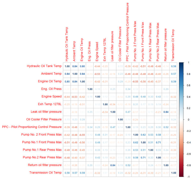
A representative graph is featured above. There was some data cleaning and formatting my dataset required to achieve a functional visual. Each variable must be a separate column in the dataset. Depending on your layout, some creativity may be required with pivoting and unpivoting columns, but resources on this are readily available on Youtube.
The real magic of this visual is that the end user is easily able to see what factors influence other factors. It is a great beginning point for understanding the holistic system and for further deep dives using machine learning and digital twin creation. The trick to any good machine learning model is picking variables that are related but not so related that the input mirrors the output. It also puts institutional knowledge to the test using statistical methods; perceptions of relationships can be tested quickly just by a review of the r^2 value.
For further study, I suggest any number of courses on machine learning or statistics through Udemy, an online learning platform.
Comments